
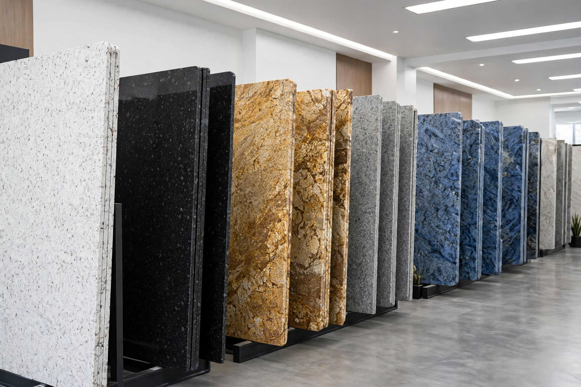
Choosing the Right Granite Color for Your Kitchen
Walk into any stone showroom and you’ll face the same wonderful problem: hundreds of granite slabs, each one different. Choosing the right color feels high-stakes because it is — your countertops will anchor your kitchen for decades. Here’s how to choose with confidence instead of overwhelm.
Start with Undertones, Not Color Names
Granite colors have names like “Blue Pearl” or “Venetian Gold,” but the name won’t tell you what you need to know. What matters is the undertone — the subtle warm or cool cast hiding beneath the main color.
- Warm undertones (gold, beige, brown, rust, cream): pair naturally with warm wood cabinets (cherry, oak, hickory), cream or beige tile, and brushed bronze or brass hardware.
- Cool undertones (gray, blue, white, black, silver): pair naturally with white, gray, or espresso cabinets, stainless steel appliances, and chrome or nickel hardware.
The most common granite regret we hear? A beautiful slab that “clashes” with the cabinets — and nine times out of ten, it’s an undertone mismatch. A gray-veined granite over honey-oak cabinets fights the room; the same granite over white shaker cabinets sings. Match the undertone first, and the rest falls into place.
How Lighting Changes Everything
Granite looks different under showroom fluorescents than it will in your kitchen. Mica and quartz crystals in the stone catch light differently throughout the day, and colors can shift noticeably.
- View slabs in natural light whenever possible. Showrooms with good daylight or outdoor slab yards give the truest read.
- Note your kitchen’s orientation. North-facing kitchens get cool, indirect light that flatters cool-toned granites. South-facing kitchens get warm light that makes warm granites glow.
- Consider your bulbs. Warm-white LEDs (2700–3000K) enrich warm granites; daylight bulbs (4000–5000K) sharpen cool ones. Your lighting choice and stone choice should agree.
Veining vs. Speckle vs. Movement
Granite’s pattern personality matters as much as its color:
- Speckled granite (like Uba Tuba or Santa Cecilia): busy, forgiving, hides crumbs and smudges beautifully. The practical choice for busy family kitchens.
- Veined granite (like Blue Pearl or Black Galaxy with gold veining): dramatic, elegant, more marble-like. Shows smudges a bit more but makes a stronger design statement.
- High-movement granite (swirling, flowing patterns): stunning as a focal point, but the movement can fight with a busy backsplash. Best paired with simple, quiet surroundings.
Rule of thumb: if your backsplash or flooring is busy, choose a quieter granite. If everything else is simple, let the granite be the star.
Always View the FULL Slab
This is the single most important tip in this article. A 4×4-inch sample shows you the color; it tells you almost nothing about the pattern. Granite is a natural material — veining, mineral deposits, and color concentration vary enormously across a single slab.
- Visit the showroom and look at the actual slabs your countertops will be cut from.
- Check multiple slabs of the same color — no two are alike, and you’ll have a preference.
- Look at the slab from a distance (6–8 feet back), not just up close. That’s how you’ll see it in your kitchen.
- Ask the fabricator to show you how your pieces will lay out on the slab, especially for islands where veining continuity matters.
Never approve a granite color from a sample chip alone. Ever.
Timeless vs. Trendy
Some granite colors are forever: whites, grays, blacks, and classic browns have looked right in kitchens for decades and will continue to. Trendy colors — the bold blues, greens, and reds that cycle through design magazines — can look dated when the cycle turns.
That said, “timeless” doesn’t have to mean boring. A dramatic black granite with gold veining is timeless and bold. The question isn’t whether the color is exciting — it’s whether you’ll still love it in fifteen years. If you’re unsure, go neutral on the big permanent surfaces (countertops, flooring) and put your personality into things you can change: paint, hardware, lighting, décor.
Take Samples Home
Most showrooms will lend or sell you a sample of the slab you’re considering. Do it — then:
- Set it on your existing (or planned) cabinets and look at it in morning, afternoon, and evening light.
- Hold your backsplash tile and flooring sample next to it.
- Live with it for a few days. The slab you loved on day one and still love on day four is the right one.
Pairing with Backsplash and Hardware
- Busy granite → simple backsplash. Subway tile, solid-color ceramic, or a quiet marble-look porcelain. Let the stone talk.
- Quiet granite → expressive backsplash. This is your chance for handmade-look tile, a bold pattern, or an interesting texture.
- Hardware should echo the stone’s metallic flecks: gold veining pairs beautifully with brass; silver-gray granite loves polished nickel or matte black.
When to Go Bold vs. Neutral
Go bold when: the kitchen is otherwise simple (white or neutral cabinets, minimal backsplash), you plan to stay in the home long-term, and the stone genuinely makes your heart race. A kitchen you love is never a mistake.
Go neutral when: you’re selling within a few years (neutral stone photographs better and appeals to more buyers), your cabinets or flooring already make a strong statement, or you tend to redecorate often — neutrals flex with every style change.
Choosing granite is one of the most enjoyable parts of a kitchen project — take your time with it. At Royal Granite Creations, our Powder Springs showroom lets you walk the slab yard and handpick the exact slabs for your kitchen, and our team will help you match undertones to your cabinets, flooring, and lighting. We fabricate and install granite, quartz, quartzite, and marble countertops in-house across Metro Atlanta. Call (678) 653-7101 for a free estimate.